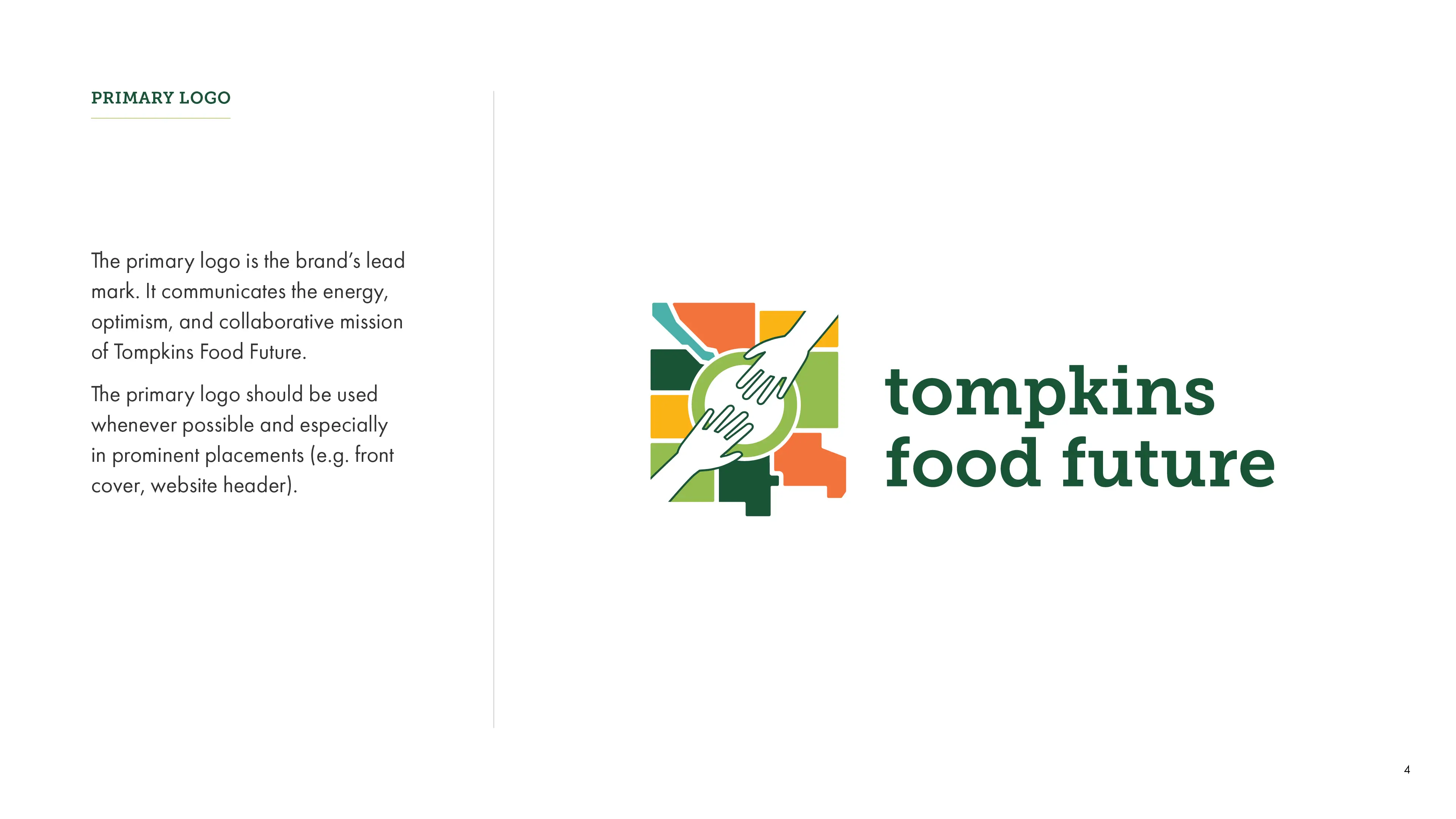

The redesigned logo communicates the energy, optimism, and collaborative mission of Tompkins Food Future, while the simplified forms and bold colors create stronger visual impact.

Original logo
Redesigned logo
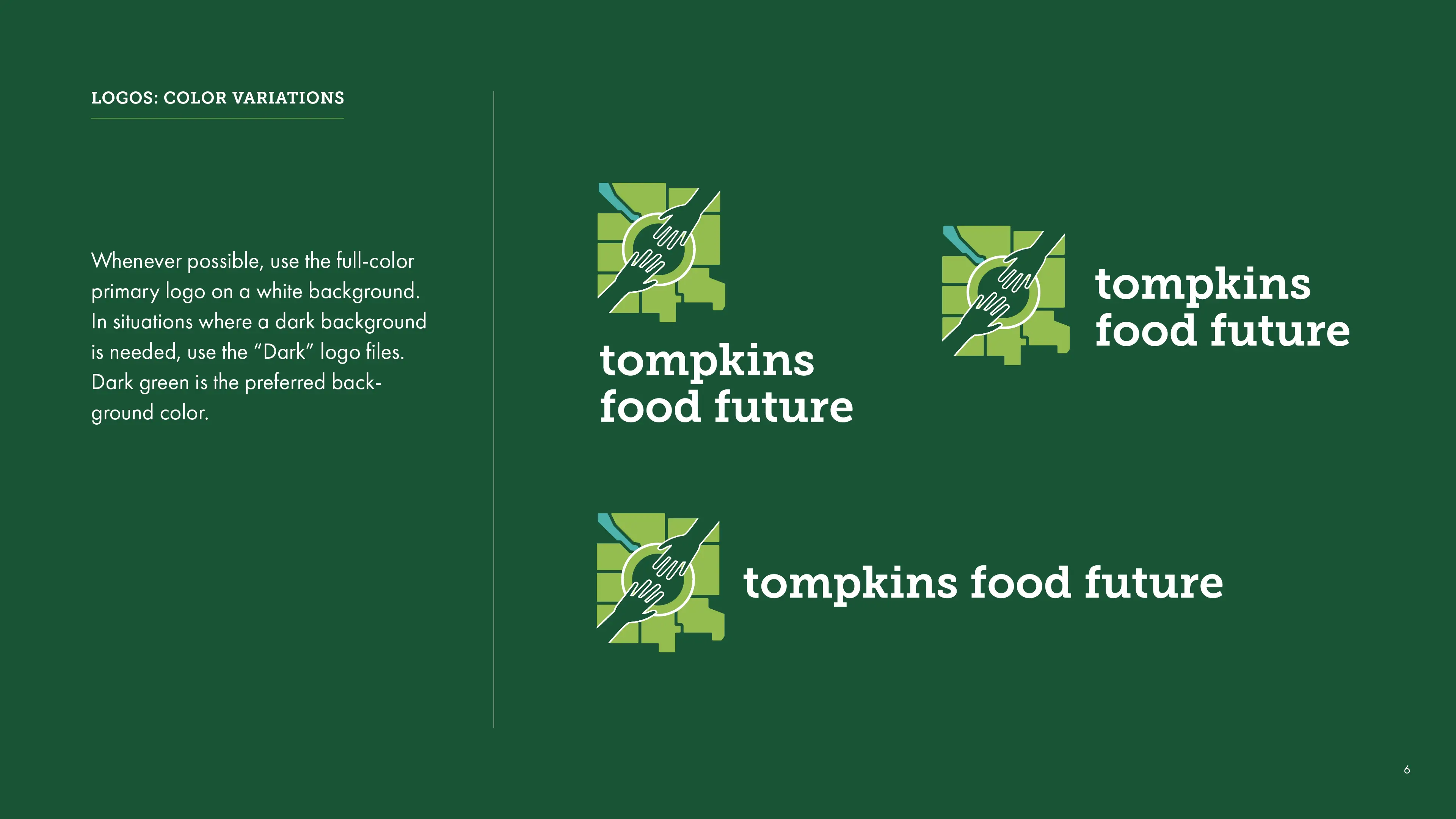
I also designed an expanded set of secondary logos that can be used across varying formats, depending on the need and the available space.


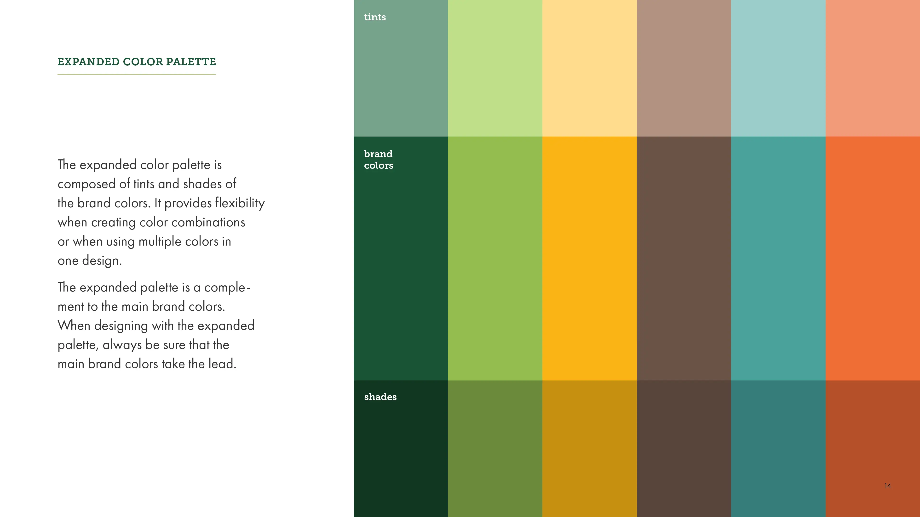
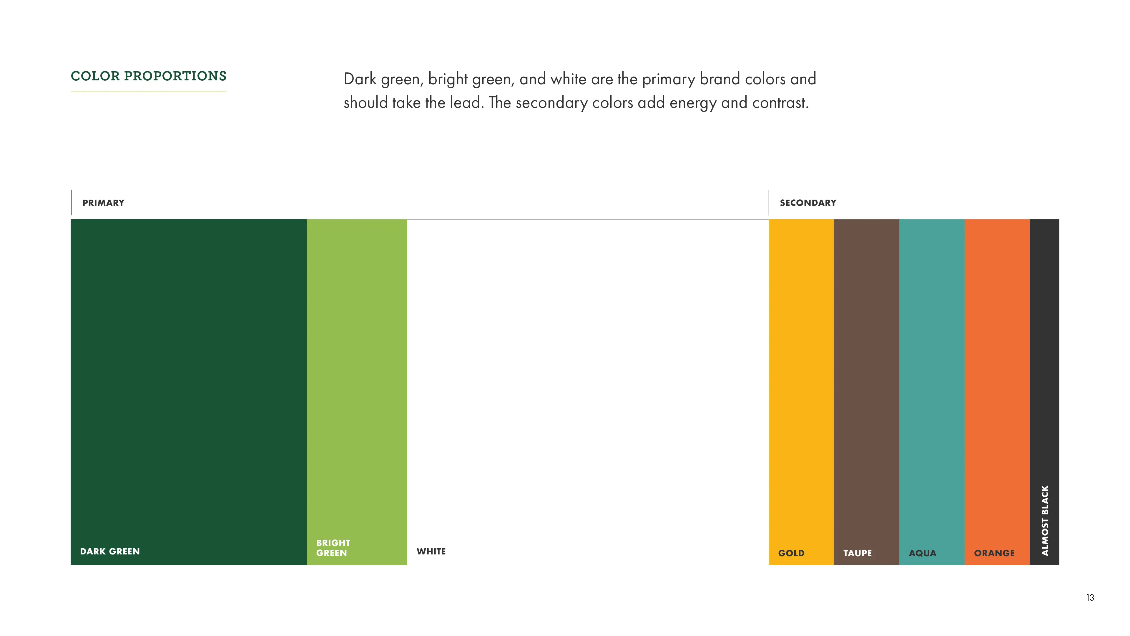
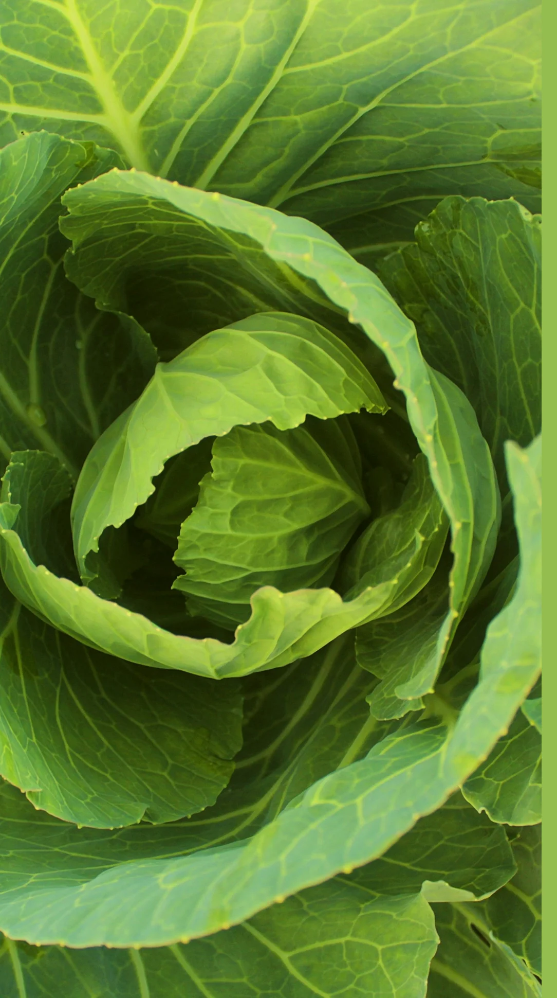
As part of the visual refresh, I updated the color palette to include bolder, more vibrant colors, inspired by the rich hues of fresh produce.

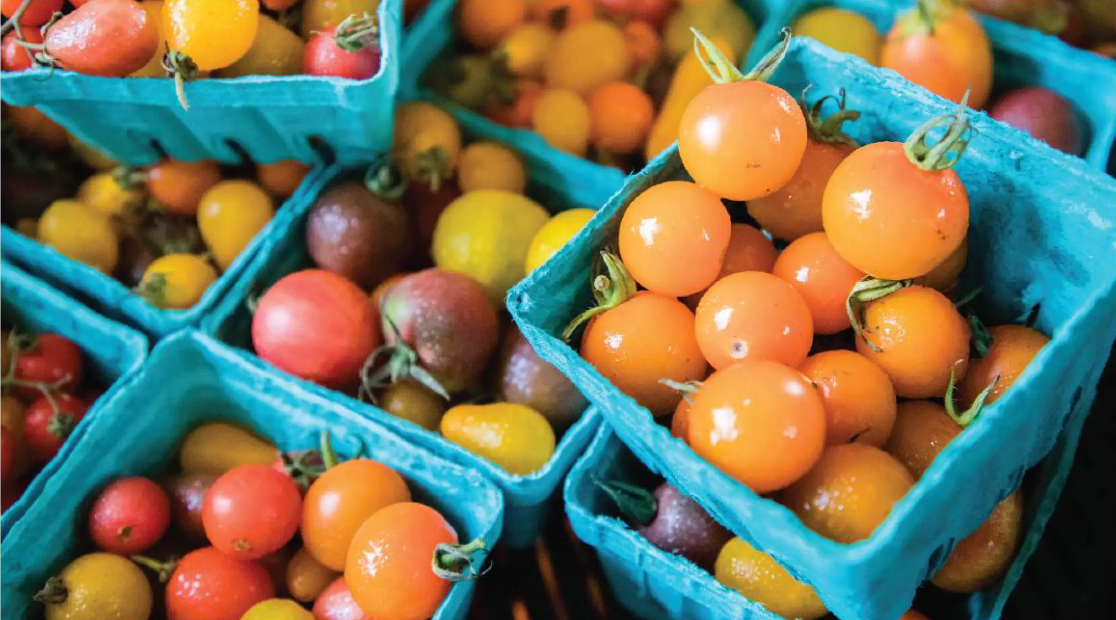
Color palette inspiration
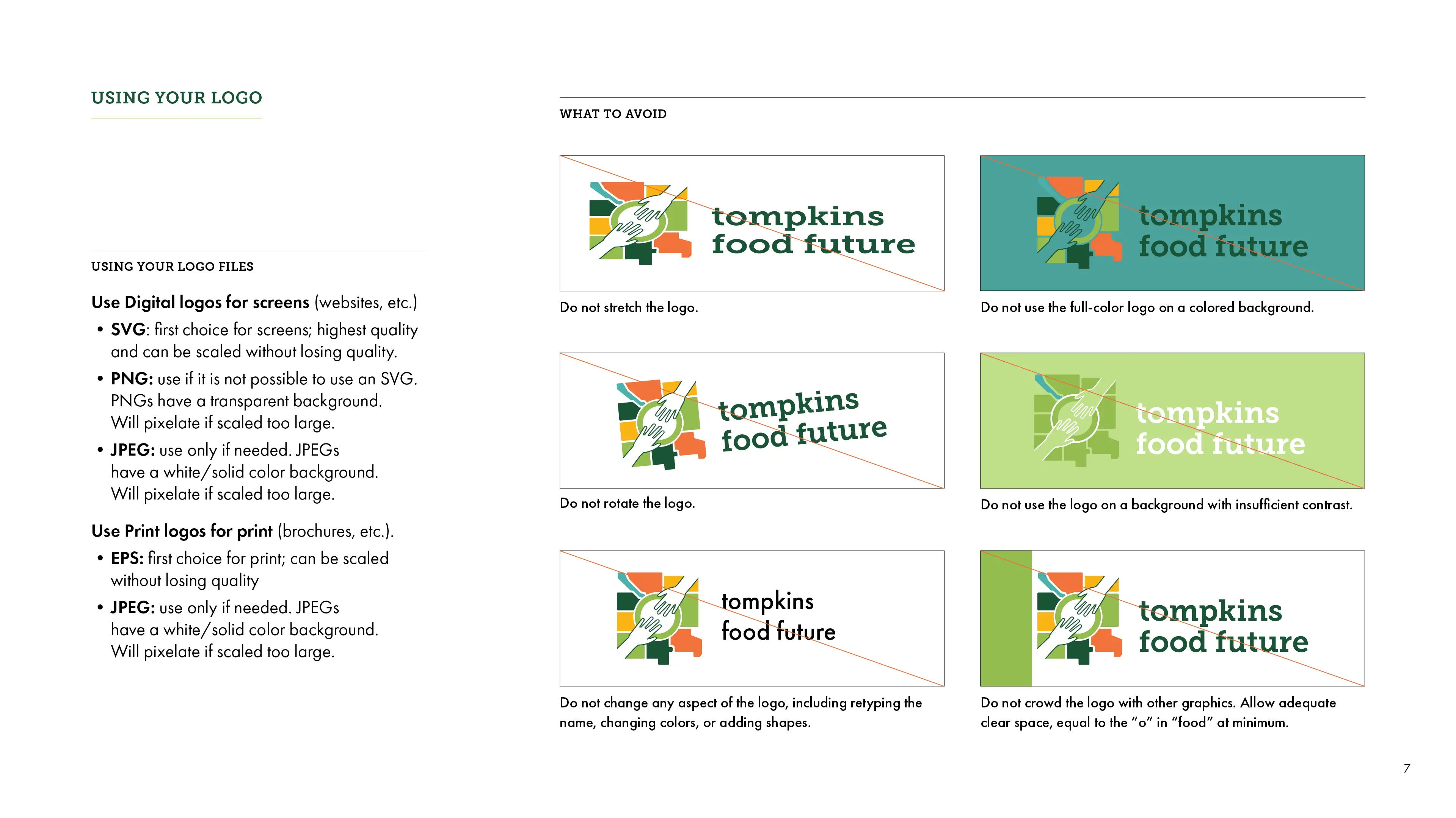
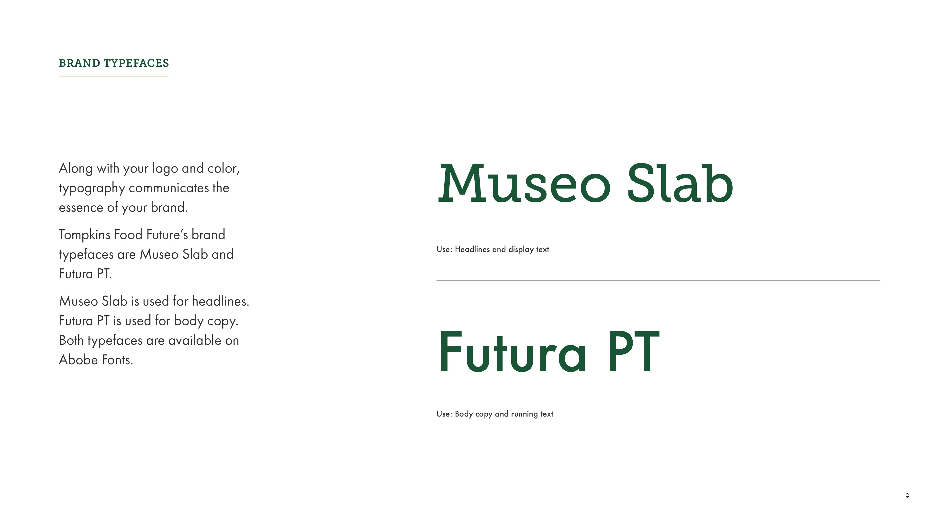
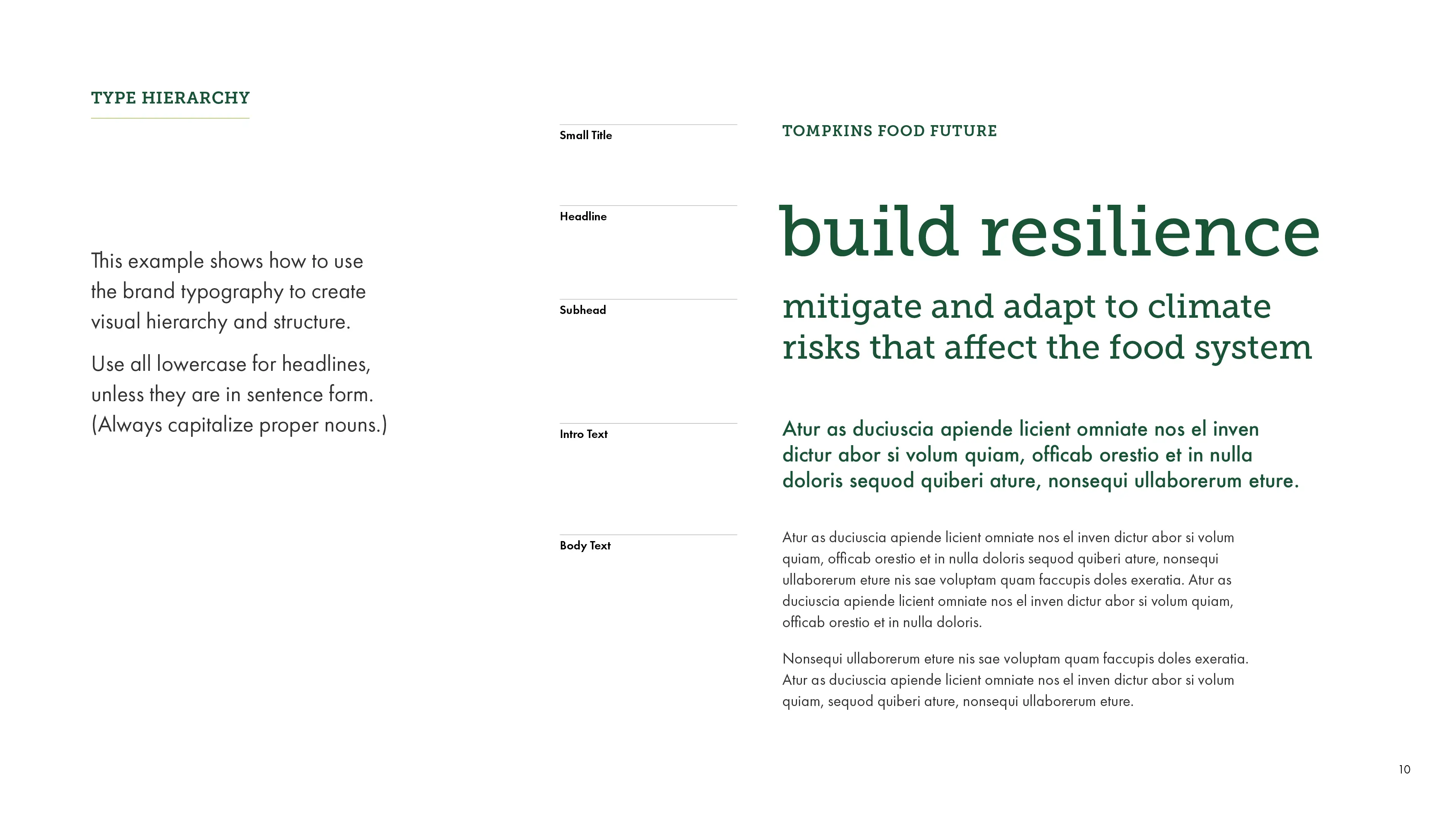
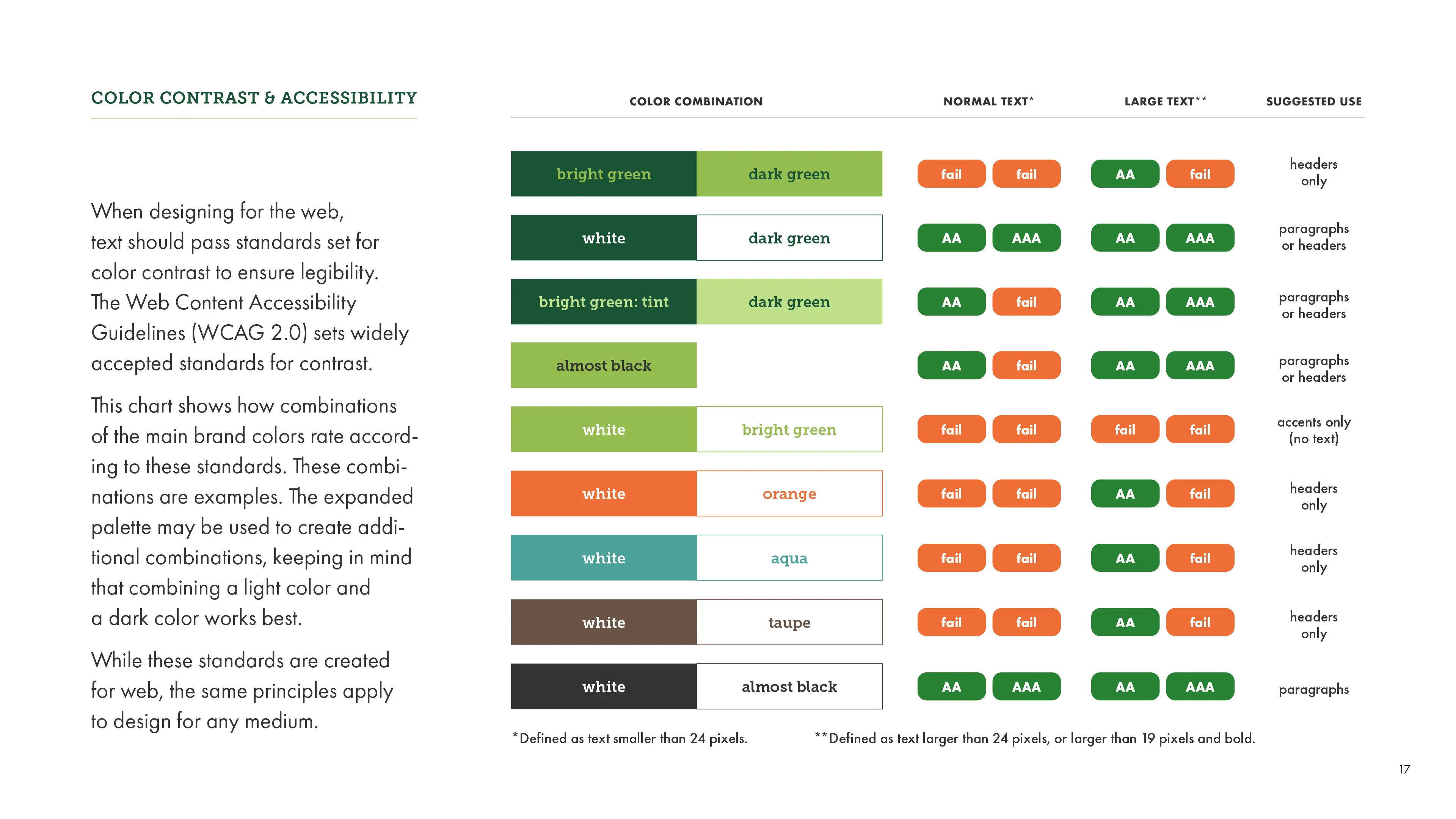
Finally, I created brand guidelines documentation to guide visual communications moving forward. The guidelines outline how to use the logo, typography, and colors, including recommendations for color contrast and accessibility on the web.