To kick off the project, I worked with Jon to define his brand personality. The four traits we identified guided the feeling of the visual identity moving forward.


I worked with Jon to design a logo that captures the brand personality. The final mark is vibrant and dynamic, with a strong sense of motion. I paired it with a typeface that feels modern, friendly, and just a little quirky. The color palette is high-contrast and energetic, but with a focus on cool, restorative tones.
I also designed an expanded set of secondary logos that can be used across varying formats, depending on the need and the available space.


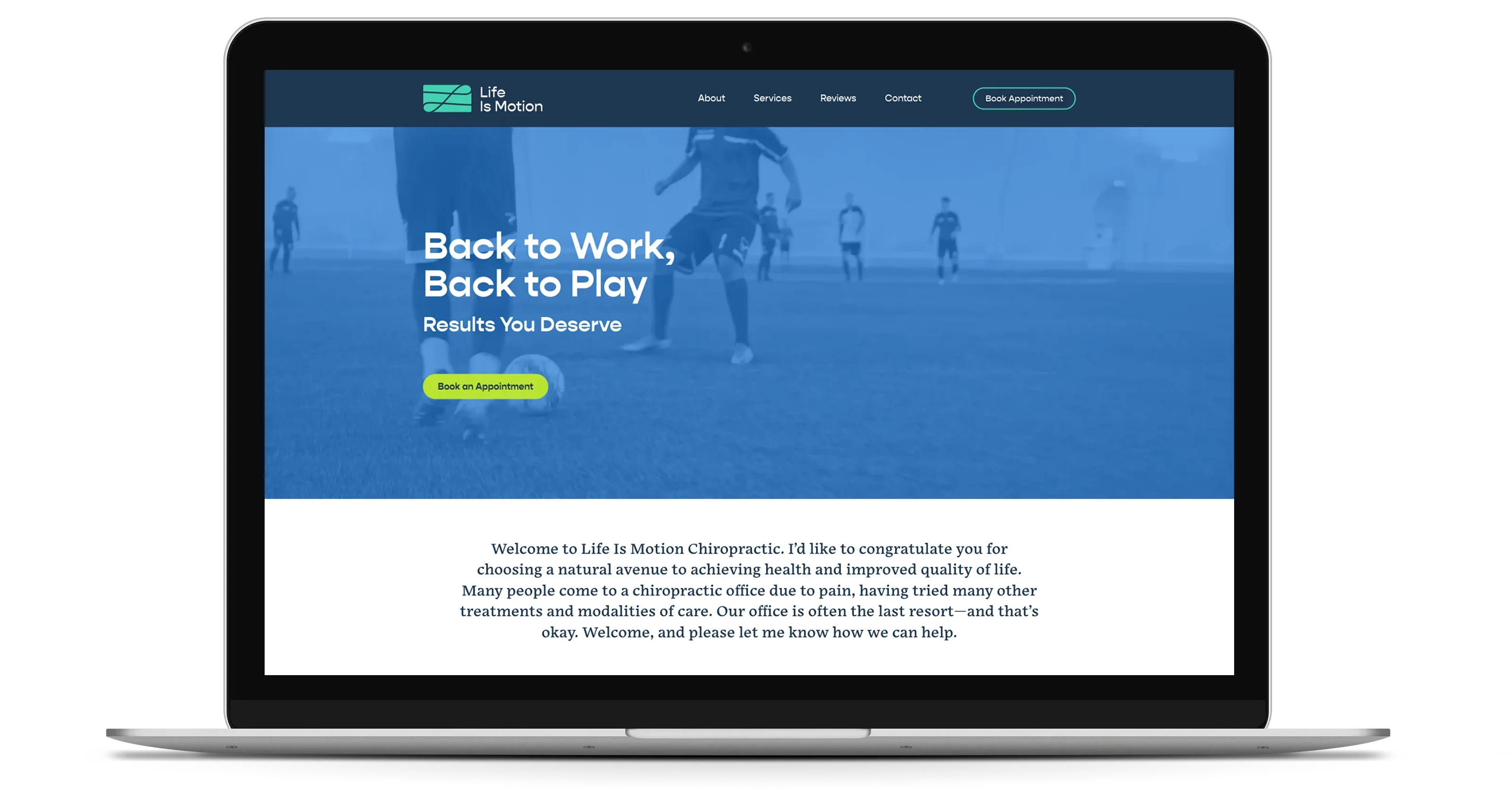
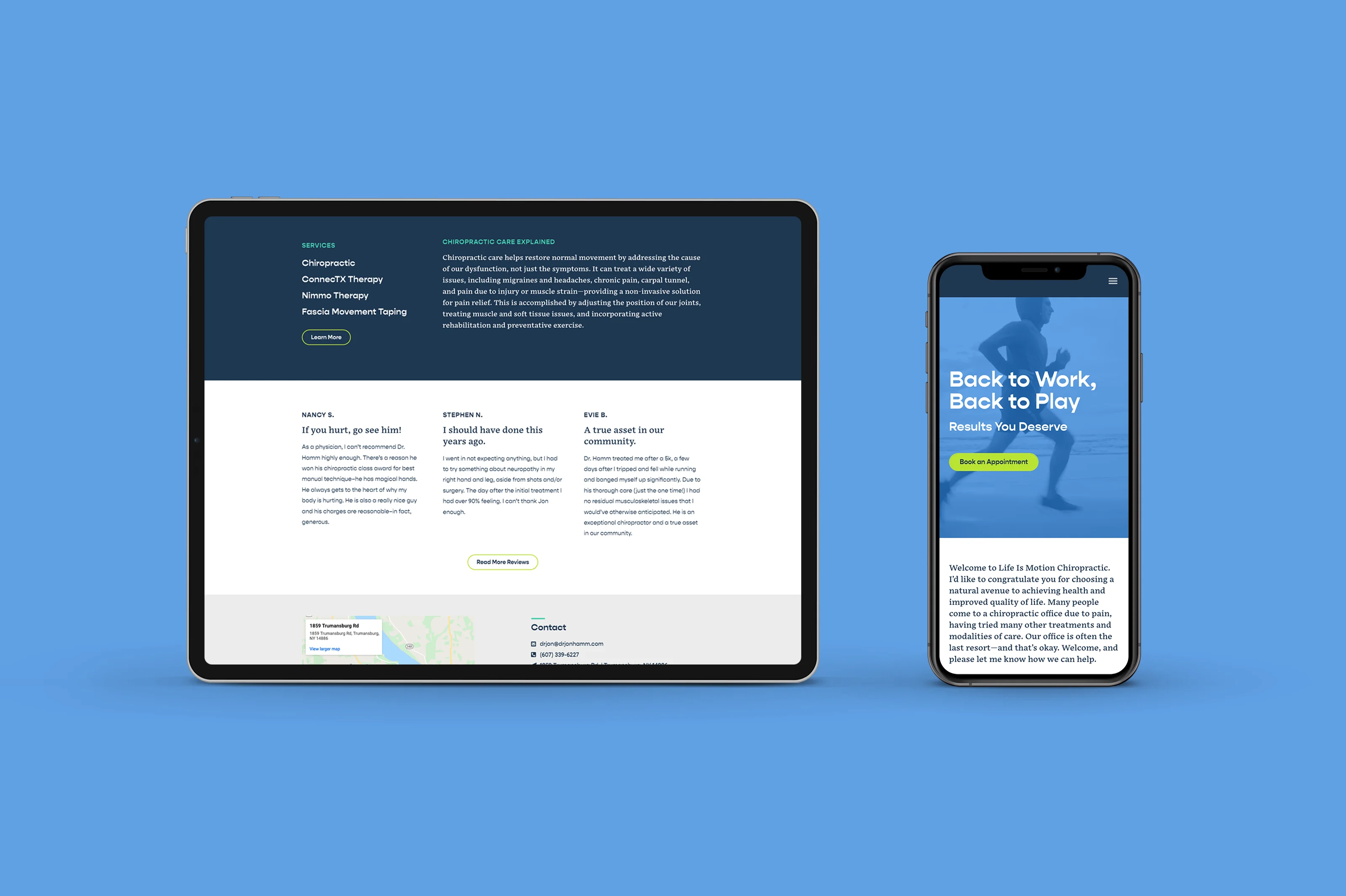
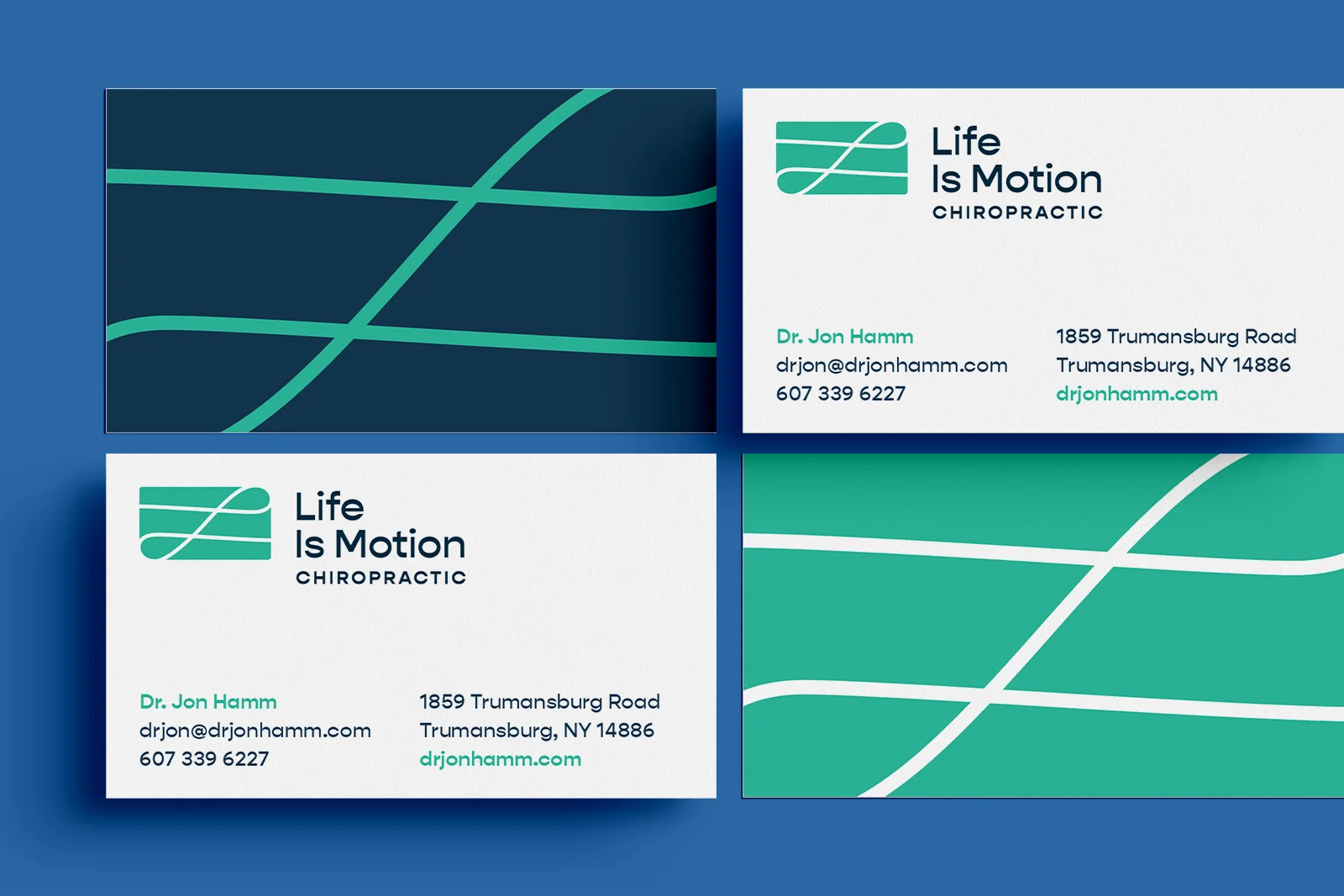
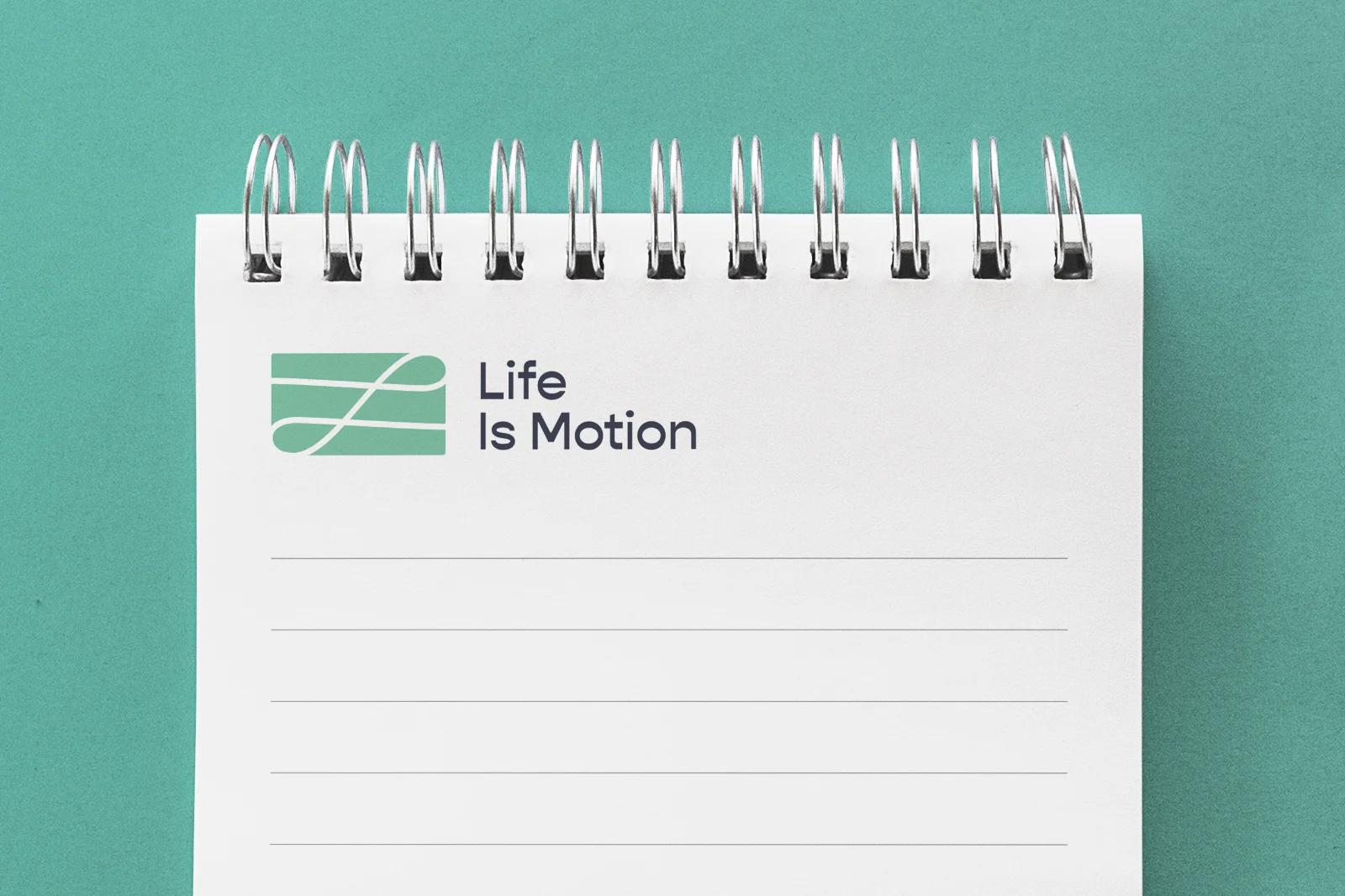
I designed a full set of collateral using the new brand identity, including stationery and a redesigned website that links to online appointment booking.